JÄÄkarhu Ice cream
Chill with the Arctic, Taste the Love – JÄÄkarhu Ice Cream
Goal
The goal of the JÄÄkarhu Ice Cream project was to create a distinctive brand identity for a vegetarian ice cream company, including designing a logo and individual packaging for six different flavors. The aim was to appeal to a younger audience, specifically children, through engaging and colorful packaging, while also developing a user-friendly landing page to enhance the brand’s digital presence.
The Project Realization
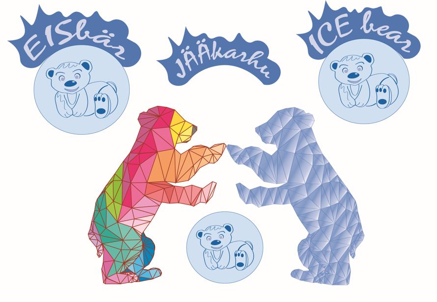
For the JÄÄkarhu Ice Cream project, I focused on developing a unique and engaging brand identity that resonated with the target market—children—while highlighting the product’s vegetarian and eco-friendly qualities. The first step was designing the logo, which aimed to represent the playful and refreshing nature of the ice cream, incorporating elements from the Arctic and its iconic ice bears. The logo was paired with a color scheme and illustrations that evoke a sense of fun, purity, and natural freshness, reinforcing the product’s connection to the northern ice and snow.
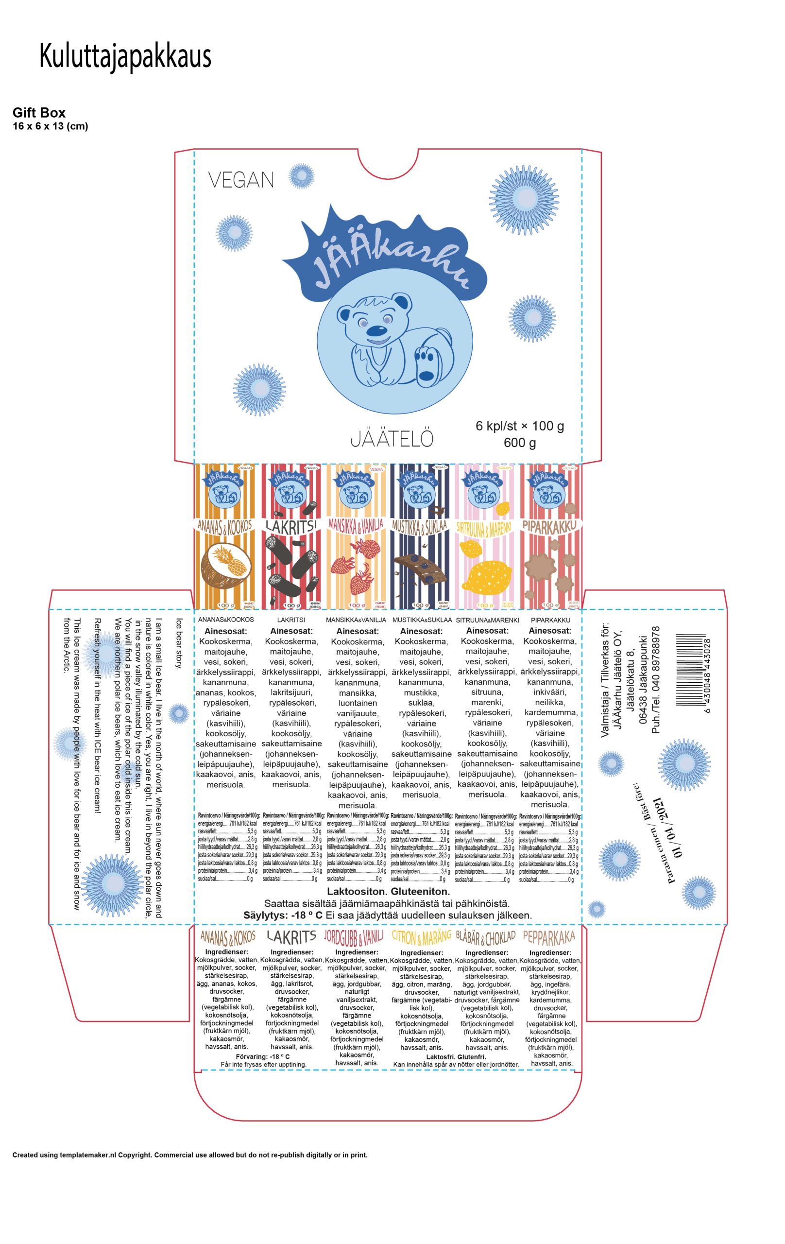
Ice bear story
I am a small Ice bear. I live in the north of world, where sun never goes down and nature is colored in white color. Yes, you are right, I live in beyond the polar circle, in the snow valley illuminated by the cold sun.
You will find a piece of ice of the polar cold inside this ice cream.
We are northern polar ice bears, which love to eat ice cream.
Refresh yourself in the heat with ICE bear ice cream!
This Ice cream was made by people with love for ice bear and for ice and snow from the Arctic.
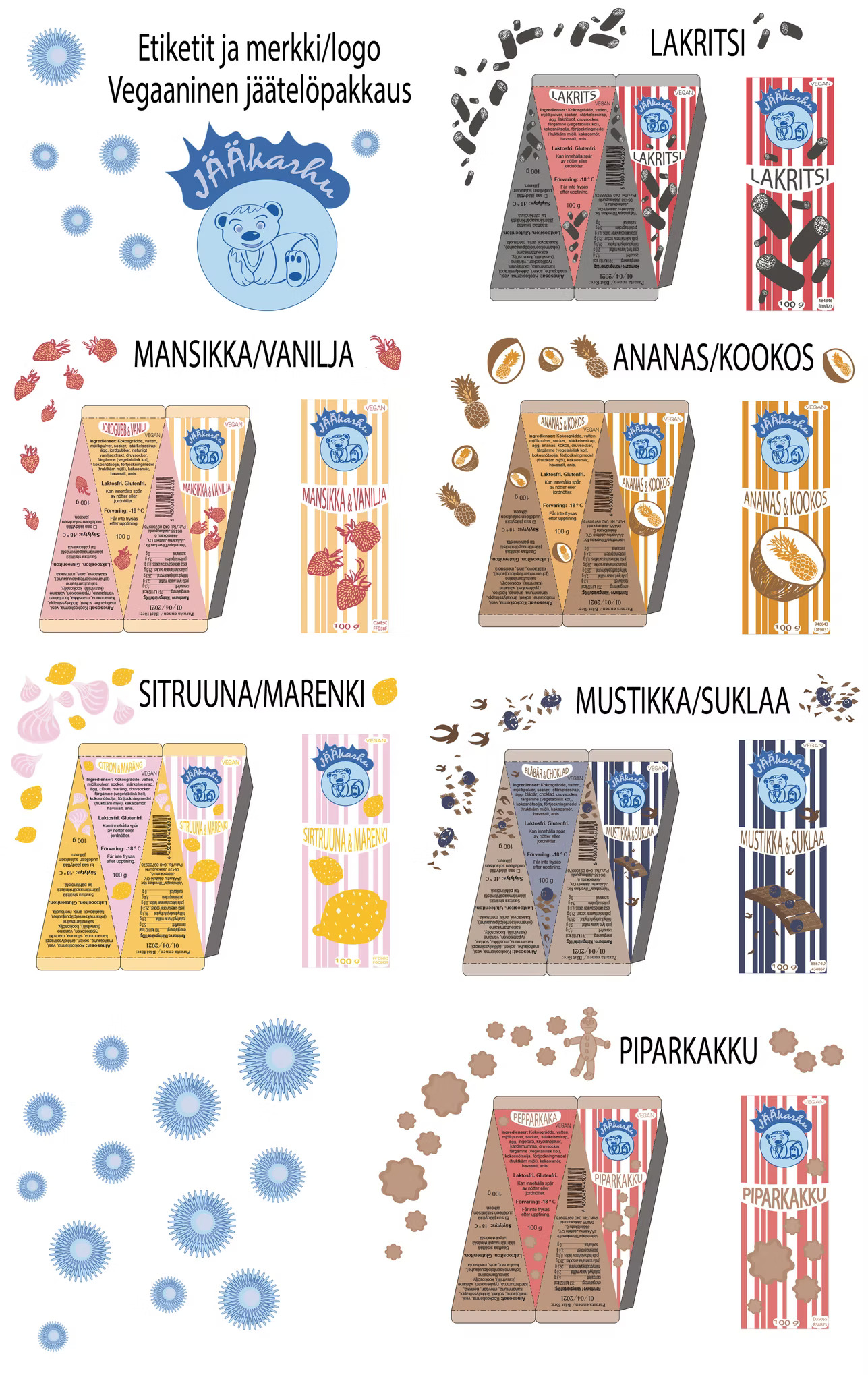
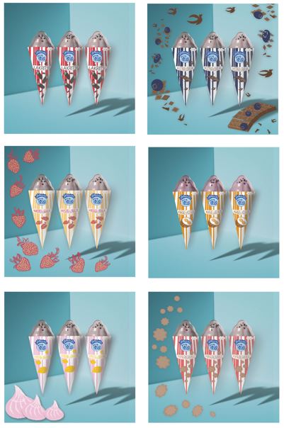
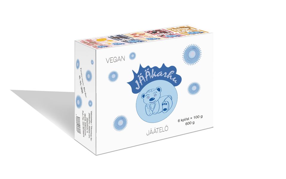
Next, I designed individual packaging for six distinct ice cream flavors, ensuring that each one had its own visual appeal while maintaining brand consistency. The packaging featured harmonic color combinations and clear, child-friendly illustrations, making each flavor easily identifiable and appealing to young consumers. Additionally, I created a multi-pack package that showcased all the flavors, designed to enhance the visual connection between the individual packages while encouraging a family-friendly, fun product experience.
To complement the physical packaging, I developed a landing page for JÄÄkarhu Ice Cream. This page served as an online introduction to the brand, featuring the story behind the ice bear and its Arctic home, as well as providing details about the product’s vegetarian ingredients and natural origins.
Brand & Logo Design with Packaging for 6 Unique Flavors
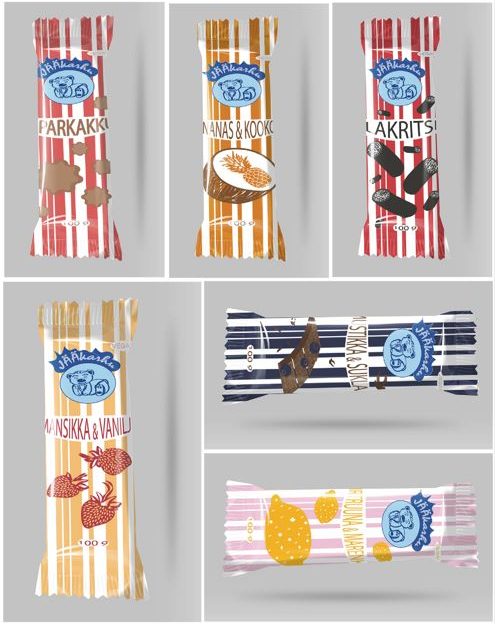
Gift box
JÄÄkarhu Ice cream landing web page
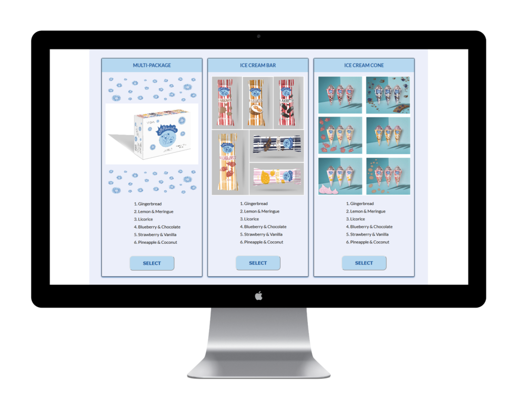
Embedded JÄÄkarhu Ice cream website
Challenges
One of the key challenges in this project was balancing the playful, child-focused design elements with the brand’s values of sustainability and natural ingredients. I had to ensure the packaging was visually appealing and fun for children while also communicating the eco-conscious, vegetarian nature of the ice cream. This required finding the right balance between bright colors, simple illustrations, and informative messaging.
Another challenge was ensuring the packaging design for each individual flavor was distinct yet consistent within the overall brand identity. I had to create designs that allowed each flavor to stand out on its own but still feel part of a cohesive product line.
The development of the landing page also presented challenges in terms of creating a user-friendly and visually appealing interface that reflected the brand’s identity while being simple enough for young audiences and their parents to navigate. I had to ensure the website was engaging, informative, and accessible, while also highlighting the brand story and product offerings effectively.
Lastly, ensuring that all elements of the design, from the logo to the website and packaging, worked together cohesively while appealing to children, posed a creative challenge. Every aspect had to reflect the playful and pure nature of the brand while still being functional and attractive to both children and parents.
Tools
- Adobe CC: Illustrator, InDesign and Photoshop
- Visual Studio Code (VS Code): HTML, CSS
